





Japanese Traditional Colors: The Names, the Plants, and the Rules Behind Japan’s Palette
Every language names color differently.
Red is red in English, rouge in French, 빨강 ppalgang in Korean. Each word arrives carrying its own history.
Japan gathers its own answers under a single term: 伝統色 dentoshoku, the traditional colors.
It is a vocabulary of several hundred named shades, and what distinguishes it is not the shades themselves but where the names come from — dye plants, flowers at a particular hour of their blooming, the humidity of the air, and the rank of the person permitted to wear them.
Many of these colors cannot really be translated.
They can only be explained.
Knowledge of Japanese traditional colors transforms the perception of a kimono, a woodblock print, and a Japanese garden in autumn.
In this article we set out what makes the Japanese palette distinctive, and then take the colors one by one, with the stories attached.
What Makes the Japanese Palette Distinctive
One: Muted Tones Rather Than Primaries
The first thing to notice is that Japanese traditional colors lean away from pure, declarative primaries and toward 中間色 chukanshoku — intermediate tones, colors softened with a measure of gray.
Contemporary Japanese fashion calls them くすみカラー kusumi-karaa, muted colors. The result is a palette that reads as delicate and restrained rather than bold. Two explanations are usually offered for why it developed that way.
The Climate Explanation
Japan is humid, and its air holds a great deal of water. Landscape seen through that air appears faintly veiled, as though under a thin mist, with its saturation lowered a step.
Japanese lifestyle has long been organized around harmony with the four seasons and with the natural world close at hand.
This is the reason why Japanese people feel a connection to くすみカラー kusumi-karaa in their lifestyle.
The Explanation from What Ordinary People Could Afford
The second explanation is economic.
Even among plant dyes, the ones capable of producing vivid color were scarce. 紅花 benibana — safflower, the source of the finest reds — and ウコン ukon — turmeric, for strong yellows — were rare goods in the ancient world.
Plant dyes also fade. Being organic, they lose their brilliance over the years, and keeping a vivid color vivid over a long period was close to impossible.
Vivid color was therefore doubly difficult: hard to obtain, and hard to hold. In practice it belonged to the Emperor, the court, and the aristocracy, and to no one else.
Then, in the Edo period (1603–1868), the Tokugawa shogunate issued the 奢侈禁止令 shashi kinshirei, the sumptuary edicts.
Luxury among commoners was prohibited, and the kimono of ordinary townspeople were restricted to three colors: brown, indigo, and gray.
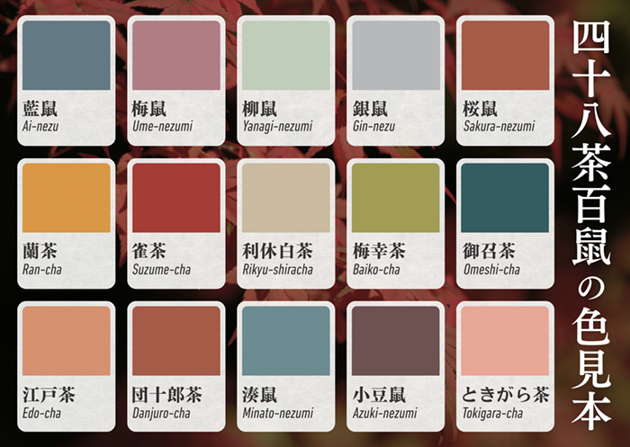
The Edokko — the townspeople of Edo, today’s Tokyo — answered with 四十八茶百鼠 shijuhatcha hyakunezumi, “forty-eight browns and a hundred grays.”
Within the three permitted colors they developed forty-eight named browns and more than a hundred named 鼠色 nezumi-iro, mouse grays, and the practice spread as a way of dressing with wit inside the limits.
Two people wearing “the same brown” were, by a margin of a few degrees of red or a half-step of depth, saying entirely different things about themselves.
A restriction had been turned into a discipline, and the discipline into a palette.
Two: Names Taken from Plants and the Natural World
The second distinguishing feature is how many Japanese traditional colors are named after plants.
The reason is straightforward: plant dyes were what people had.
Cloth was colored with 紅花 benibana — safflower, 茜 akane — madder, 藍 ai — indigo, and their relatives. The dyes were drawn from roots, leaves, and bark, and the soft coloration that natural dyestuffs produce sat naturally alongside a way of living that valued accord with nature and the turning seasons.
There is a further point worth dwelling on. The names record not only what a plant looks like but how minutely its color shifts as the season moves. A cherry tree is not one color. Its color changes by degrees from the opening of the blossom to the moment the petals fall, and to hold those differences apart the language needed more intermediate tones and more names. That is a large part of why the palette grew as fine-grained as it did.
Three: An Abundance of Browns, Grays, and Blues
As noted above, brown, gray, and indigo were the few colors in which an Edo commoner was allowed to be fashionable. Within each of them, variants multiplied: brighter and darker, deeper and paler, adjusted toward red or toward blue.
Alongside the sumptuary edicts, the Edo period developed an aesthetic called 粋 iki.
Its principle was not to dress conspicuously but to strip away unnecessary ornament and refine instead one’s bearing, one’s gestures, one’s spirit. In its own time iki took root as an ideal of urbane, unlaboured taste, and its specificity is such that no other language is usually said to have an exact equivalent.
藍色 ai-iro — Indigo Blue, the Color Closest to Japanese Life
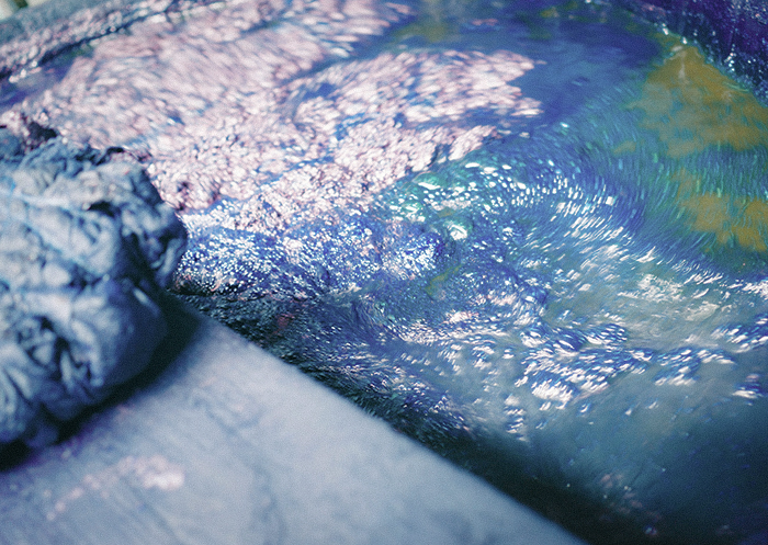
The deep blue of 藍色 ai-iro has always been near at hand in Japan, for the simple reason that 藍染 aizome, indigo dyeing, has been part of the culture for centuries.
It was also, under the sumptuary edicts, one of the few colors a commoner could wear. So the dyers widened the range from the inside: by controlling how many times the cloth was returned to the indigo vat, they produced a graded family of blues running from the palest wash to a blue so deep it approaches black, each step with its own name.
浅葱色 asagi-iro — A Color That Reversed Its Reputation
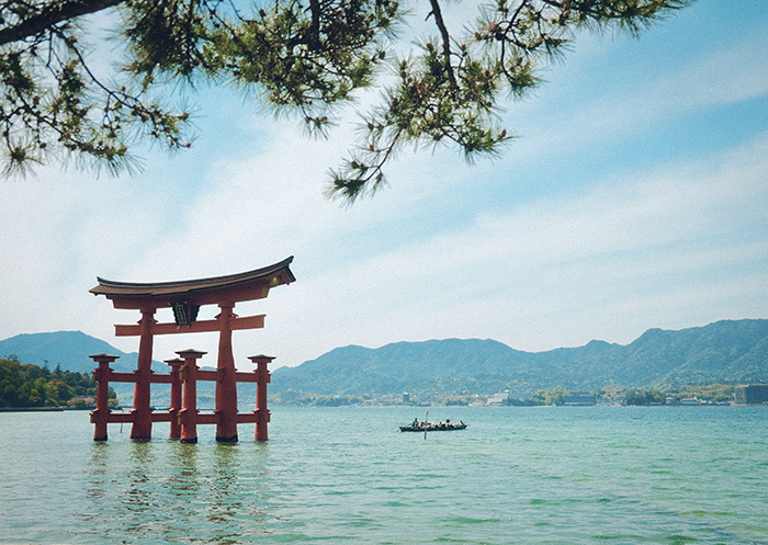
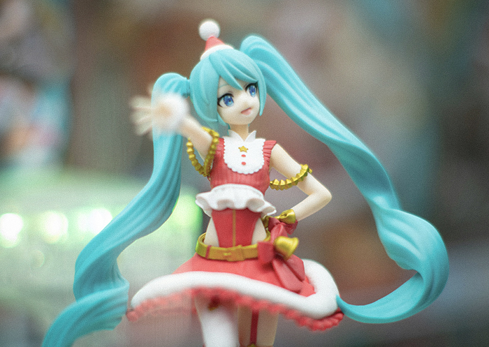
浅葱色 asagi-iro is a bright blue-green, named for the color of a spring onion leaf: 浅い asai, pale, plus 葱 negi, onion.
It was fashionable in the Edo period, particularly between the Genroku era (1688–1704) and the Horeki era (1751–1764).
It was also, however, the color most often used for the lining of the 羽織 haori — the short outer jacket — worn by low-ranking samurai and by provincial samurai posted to service in Edo.
That association turned it into a joke about country manners. A samurai with no feel for taste or refinement could be dismissed as 浅葱裏 asagi-ura, “asagi lining,” or 浅葱侍 asagi-zamurai, “an asagi samurai.”
What reversed that image was the rise of the 新選組 Shinsengumi at the very end of the Edo period, the shogunate’s special police force in Kyoto in the 1860s.
The blue-green of their famous haori was precisely asagi.
The choice is attributed to the vice-commander Hijikata Toshizo, who is said to have taken it from the asagi 裃 kamishimo — formal samurai dress — worn in the seppuku scene of Chushingura, the celebrated account of the forty-seven loyal retainers who avenged their lord.
Worn in that light, the color announced a readiness to die, and the asagi haori settled into the popular imagination as the image of the Shinsengumi’s loyalty.
There is a modern postscript. The image color of the virtual singer Hatsune Miku, now known worldwide, is often described as close to asagi, and vivid blue-greens are broadly the palette that visual culture reaches for when it wants to signal cyberspace. A color can travel, across a few centuries, from “provincial” to “futuristic.” That mobility is part of what makes the traditional colors interesting.
Japan Blue, Samurai Blue, and the School Uniform
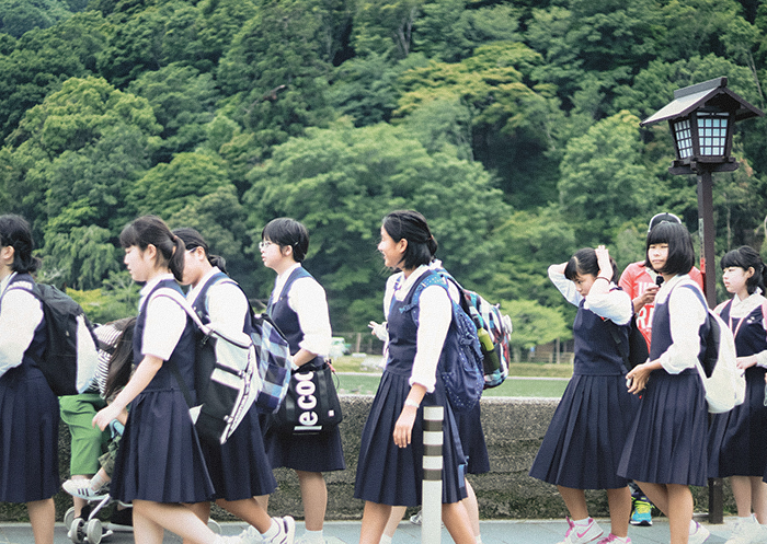
Even after Western dress became standard from the Meiji era (1868–1912) onward, indigo stayed close to Japanese clothing. A great many Japanese school uniforms are still built on it.
One reason is continuity: when the country moved from kimono to Western clothing, indigo was the color people already lived with.
Another is a foreign observer. Atkinson, a British chemist who came to Japan in the 1870s to teach, called the color “Japan Blue” and carried the phrase abroad. That is where the world’s association of Japan with indigo begins in earnest, and it is very likely why the national football team is known today as Samurai Blue, with a uniform built on the same deep indigo.
The Stories Behind the Colors
The origins of these colors are the most direct route into the culture that made them. Here are the ones worth knowing.
絶対禁色 zettai kinjiki — The Colors No Subject Could Wear
In the Japanese court, color was not a preference. It was law. From the earliest ranking systems — the 冠位十二階 kan’i junikai, the twelve cap ranks instituted in 603, assigned each rank its own color — a person’s robes announced their position, and shades reserved for the upper ranks were called 禁色 kinjiki, forbidden colors.
Two colors, however, stood outside the ranking system altogether.
No subject of any rank could wear them at all.
These are the 絶対禁色 zettai kinjiki, the absolutely forbidden colors: 黄櫨染 korozen and 黄丹 oni.
黄櫨染 korozen — Worn Only by the Emperor
黄櫨染 korozen is dyed from the bark of the ハゼノキ hazenoki, the Japanese wax tree, combined with 蘇芳 suo, sappanwood.
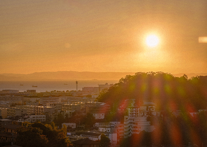
Its behavior in light is the point of it. Under direct sun it burns from a golden brown into 茜色 akane-iro, madder red, the color of a late sunset; in shade it settles back into a yellowish brown. Because that is close to the color of the sun itself, it was held to be the color most fitting for the Emperor, who is descended, in the imperial tradition, from 天照大神 Amaterasu Omikami, the Japanese sun goddess.
It is said to have become an absolutely forbidden color after Emperor Saga wore it in 820. Its adoption for the enthronement ceremony came much later than one might expect: only in the Meiji era. The reason is that the age of warrior rule had ended, and in the work of reviving the traditions of the imperial court, korozen was brought into the rite.
The dyeing technique is still held today by craftsmen in Kyoto who have carried it forward. At the 即位礼正殿の儀 Sokui-rei-Seiden-no-gi, the enthronement ceremony of 2019, the Emperor wore the 黄櫨染御袍 korozen no goho, the imperial robe in this color.
Much of the public commentary that followed came down to a single observation: a color that takes the sunlight and shines is a beautiful thing to see.
黄丹 oni — Worn Only by the Crown Prince
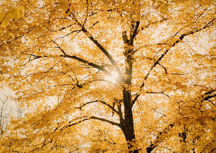
黄丹 oni is dyed by combining 紅花 benibana, safflower, with クチナシ kuchinashi, gardenia.
Both were costly, and bringing the color to that pitch of brilliance is said to have taken extraordinary labor. Precisely because it was so difficult, the Nara period (710–794) fixed 黄丹 as the formal robe color of the crown prince.
Where korozen images the sun, 黄丹 images the sun that is about to rise: the light of early morning, and the heir who has not yet ascended. Most recently, at the 立皇嗣の礼 Rikkoshi-no-rei of 2020, in the rite known as 宣明の儀 Senmei-no-gi, Crown Prince Akishino wore the robe called 黄丹袍 oni no ho.
重(襲)の色目 kasane no irome — Wearing the Season in Layers
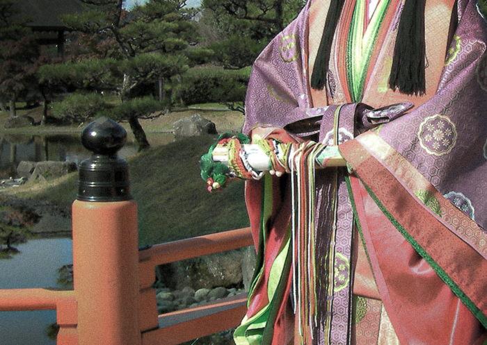
In the Heian period (794–1185), women of the imperial court wore the 十二単 junihitoe, the formal layered robe whose name means “twelve layers.” Its most refined effect was 重(襲)の色目 kasane no irome, the color scheme produced by the layering itself.
The silk used was extremely thin, so combining several garments produced colors that no single cloth could give: the lower layer read faintly through the upper one, and the two together made a third thing.
Two different kanji are read kasane, and they are not interchangeable:
– 重 — a scheme made of two cloths, the outer fabric and its lining
– 襲 — outer and lining plus further layered garments, building a gradation
Each combination carries a name drawn from nature, which means that wearing one correctly required wearing it in its own season.
A woman’s choice was read closely: it displayed her taste, and taste was understood to display character. Below are representative combinations, given in the form of the name of the combination followed by the season in which it was worn.
The examples here are all 重の色目, outer cloth paired with lining.
One: 桜 sakura — Cherry Blossom, Spring
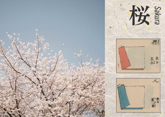
Combination pattern one:
– outer: white
– lining: red
Combination pattern two:
– outer: white
– lining: 縹(花田)色 hanada-iro
A note on 縹(花田)色 hanada-iro: a bright blue produced by indigo dyeing, bluer and deeper than asagi. The name is said to come from the sight of the threads drifting — 漂う tadayou — in the indigo vat.
桜, the flower that stands for Japan itself, has several accepted combinations.
Pattern one is the obvious and beautiful one: white over red, so that the red rises faintly through the thin white silk and produces exactly the pink of a blossom.
Given how the layering works, it is hard to imagine a more direct rendering of the flower.
What this author finds more interesting is pattern two. “Cherry blossom color” normally suggests a pink close to white. To reach instead for white and blue is to render not the flower alone but the flower against a spring sky. The refinement of the eye that made that choice is worth pausing over.
Two: 杜若 kakitsubata — Rabbit-Ear Iris, Summer
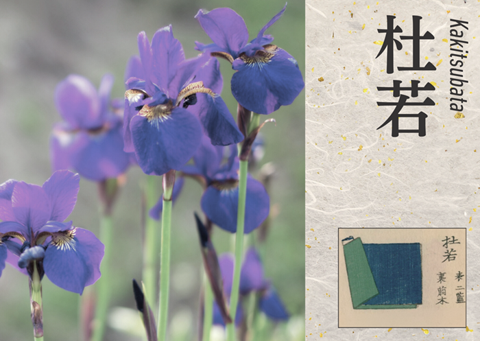
Combination pattern:
– outer: 二藍 futa-ai
– lining: 萌黄 moegi
This is the iris rendered in cloth, and both colors used here recur constantly across the traditional palette.
二藍 futa-ai, literally “two indigos,“ is crimson from safflower laid over an indigo ground, landing anywhere between blue-purple and red-purple.
The same name covered noticeably different tones in the Heian period, because the balance was set by the wearer’s age: the young wore it with the crimson strengthened, and as one grew older the indigo was strengthened instead.
That convention surfaces in The Tale of Genji, the early eleventh-century novel by Murasaki Shikibu, in a scene where Hikaru Genji warns his son Yugiri that a futa-ai with too much red in it will invite people to take him lightly.
萌黄 moegi, by contrast, is the bright yellow-green of plants just breaking bud.
Layer the two, and the iris appears.
Three: 今様色 imayo-iro — “The Color of Now,” All Seasons
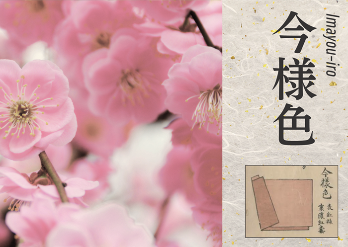
Combination pattern:
– outer: 紅梅 kobai — red plum blossom
– lining: 濃紅梅 koki-kobai — deep red plum
今様 imayo means “in the present style,” which is to say fashionable. In the Heian period the bright red produced by safflower-dyed 紅梅 kobai was the color women wanted, and it held that position long enough to be named for the fact of being wanted.
Safflower, however, was a precious dye. A color this vivid was in practice available only to the high-born, which is part of what made it desirable in the first place.
It appears in The Tale of Genji as well: a robe in this color is recorded among the garments Hikaru Genji sends to Murasaki no Ue, his principal wife. Sending the woman he loves most a robe in the color everyone wants that season is, in its way, a fairly plain statement of feeling.
The layering combinations above are drawn from two illustrated color manuals held by the National Diet Library Digital Collections: 『薄様色目』 Usuyo Irome by Nakamura Korenori, pages 10 and 16, and 『重色目』 Kasane Irome by Ikai (猪飼正彀), page 8.
江戸紫 Edo-murasaki and 京紫 Kyo-murasaki — Two Purples, Two Cities
The Edo period had two purples in fashion at once, one in the east and one in the west, and the difference between them is a fair summary of the difference between the two cities.
One: 江戸紫 Edo-murasaki
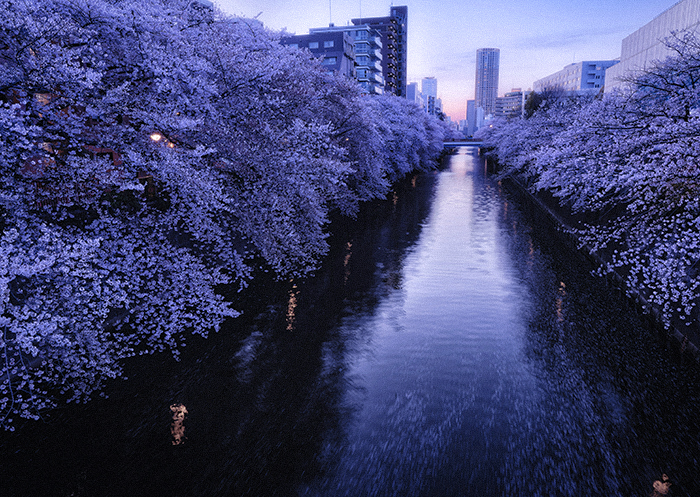
A purple inclined toward blue, with a strong and forthright presence.
It was dyed from the root of 紫草 murasaki, the gromwell plant, which grew famously on the Musashino plain in what is now the western part of Tokyo. That local source made it a specialty of Edo and a matter of local pride.
Because it was a color born in the Edo period, it was also called 今紫 ima-murasaki, “the new purple.“ It became the emblematic color of the Edokko who prized 粋 iki, and it is used on the kabuki stage as well, which is worth noting: kabuki is where Edo taste is preserved most visibly.
Two: 京紫 Kyo-murasaki
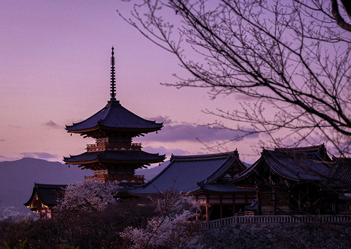
A purple inclined toward red, and unmistakably courtly.
Because it carries on the older tradition of purple dyeing, it also goes by the name 古代紫 kodai-murasaki, “ancient purple.”
The difference from Edo-murasaki is one of intent: where the Edo color asserts, the Kyoto color puts elegance forward without apology. It is the temperament of western Japan, where courtly culture had been cultivated for a thousand years.
One caution for readers who go looking in period sources. Ise Sadatake, a 旗本 hatamoto — a direct retainer of the shogunate — and a scholar of court and warrior usage, recorded in his 『安斎随筆』 Ansai Zuihitsu that in the present age the color called Kyo-murasaki is the true purple.
He then describes Edo-murasaki as being like the color of the 杜若 kakitsubata flower, that is, 葡萄染 ebizome.
Since both kakitsubata and ebizome denote reddish purples, the Ansai Zuihitsu is evidently treating Kyo-murasaki as the bluish purple — the reverse of the modern usage. The names have moved since. It is worth reading period color terms with that in mind.
In Closing: Color as a Way into Japanese Culture
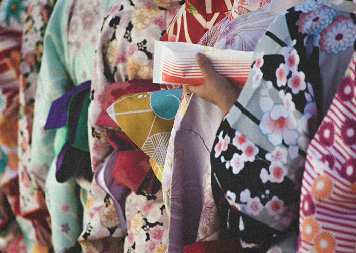
Learn where these colors came from and Japanese culture opens a little further. The palette is a record of what was available, what was permitted, and what people did within those limits.
The point most worth carrying away is how completely the names are bound to a life lived in accord with the seasons and with the natural world.
A color here is rarely just a wavelength. It is a plant, a month, a rank, a piece of weather, sometimes a joke that outlived the people who told it.
The 重(襲)の色目 kasane no irome combinations we could not cover here deserve an article of their own, and will get one.
KOTO is a journal of Japanese craftsmanship, culture, and the aesthetic sense behind them.
- SHARE
-


( language )