





Kasane no Irome: The Names, the Seasons, and the Colors Behind the Twelve-Layer Kimono
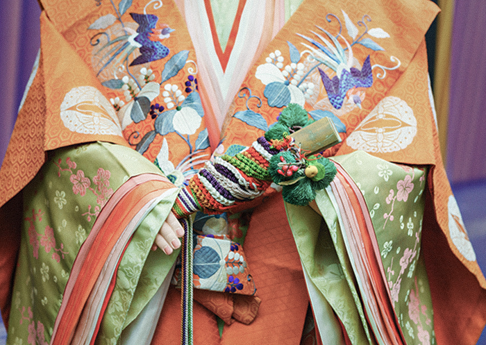
The Heian period (794–1185) gave rise to 国風文化 kokufu bunka, Japan’s own indigenous court culture.
Nowadays, 国風文化 kokufu bunka lives on in a great many traditions that shape Japan.
Among them, the 十二単 junihitoe, the layered robe worn by women of the imperial court, passes down in one of the most striking things Japan ever produced. This article explains about 重(襲)の色目 kasane no irome, which was used in 十二単 junihitoe .
We have written elsewhere about 伝統色 dentoshoku, Japan’s traditional color vocabulary, which the names below draw on constantly. That companion piece is worth reading alongside this one — this article picks up exactly where it left off, with the full seasonal palette of the 十二単 junihitoe.
What Is Kasane no Irome?
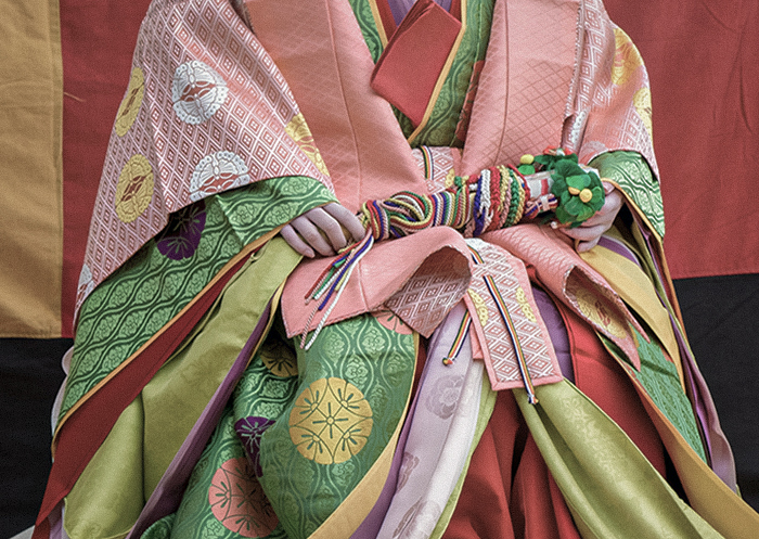
重(襲)の色目 kasane no irome is the color scheme created by layering 着物 kimono, japanese traditional garment. It is chiefly associated with the junihitoe of the Heian court.
着物 kimono was made from silk at that time, but it was extremely thin, and layering it produced colors no single piece of cloth could give: one shade showing faintly through another, the two together making a third.
The combinations were built around the four seasons and the natural world, and choosing correctly for the season mattered. Heian women rarely appeared in public and rarely showed their faces even indoors; in a world like that, a good eye for color combination became one of the clearest ways to display taste — and taste, in turn, was read as a measure of character.
Two kanji are both read kasane, and they name two different things:
– 重 — a combination built from two cloths: an outer fabric and its lining
– 襲 — outer and lining plus further layered garments on top, building a gradation across several pieces
This article covers 重の色目, the two-cloth combinations of outer fabric and lining.
What Is the Junihitoe?
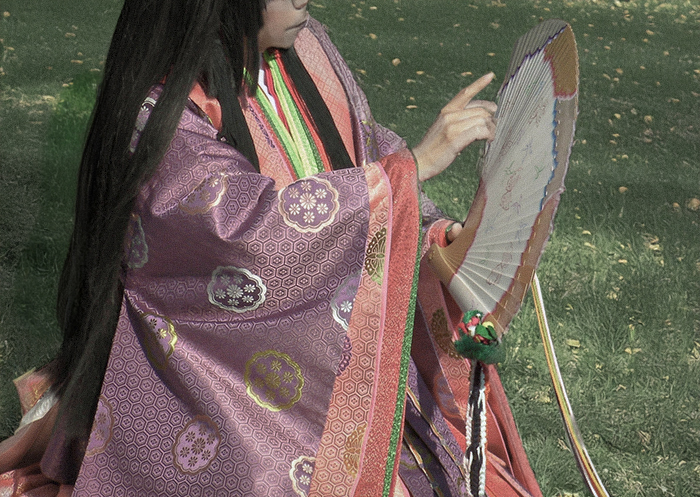
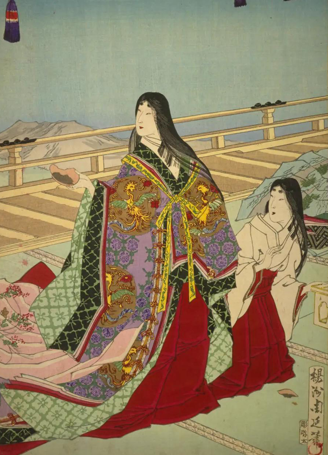
十二単 junihitoe was the robe worn by 女房 nyobo, women who served the nobility of the Heian court. It is thought to have taken its established form in the middle of the Heian period, and it was worn for court ceremonies and other formal public occasions. Because it was the formal court dress of the nyobo, it is also known as 女房装束 nyobo shozoku, “the nyobo’s attire.”
The way it is put on was formally codified only much later, at the enthronement ceremony of the Taisho era (1912–1926), when it was also given the name 五衣唐衣裳 itsutsuginu-karaginumo. Today it is worn by women of the imperial family at court ceremonies — most recently by Empress Masako at the enthronement rite of 2019, and by Princess Kiko, wife of Crown Prince Akishino, at the investiture rite of 2020, both of which drew wide public attention.
The Structure of the Junihitoe
![[Source] Genji Gojuyonjo, No. 21, Otome (Genji Gojuyonjo), by Gekko | National Diet Library Digital Collections](https://koto794.com/common/wp-content/uploads/2026/02/004_omote_juni-hitoe-1.png)
![[Source] Nishiki Hyakunin Isshu Azuma-ori, illustrated by Katsukawa Shunsho, p.42 | National Diet Library Digital Collections](https://koto794.com/common/wp-content/uploads/2026/02/005_ura_juni-hitoe.png)
![[Source] The Tale of the Princess Kaguya - Studio Ghibli | STUDIO GHIBLI. Studio Ghibli's film The Tale of the Princess Kaguya also depicts Kaguya-hime undergoing the mogi ceremony.](https://koto794.com/common/wp-content/uploads/2026/02/006_kaguyahime028.jpg)
Studio Ghibli’s film The Tale of the Princess Kaguya also depicts Kaguya-hime undergoing the mogi ceremony.
A full junihitoe is built from several garments worn one over another. In the order they go on:
長袴 nagabakama — the bottommost garment, put on first together with the white undergarment called 小袖 kosode. Whereas modern hakama come in two types, trouser-like and skirt-like, the junihitoe uses the skirt type exclusively.
The color of hakama was ordinarily red; unmarried women or girls not yet of age wore a deep purple called koki-iro instead.
単 hitoe — worn between the nagabakama/kosode and the layered robes described next.
五衣 itsutsuginu — the collective name for five 袿 uchiki robes layered over the hitoe. Layering them produced the distinctive gradated coloring that gives 襲の色目 its name, and it is here that the most elaborate, season-specific color combinations appeared. Five layers of silk were heavy enough to make movement difficult, so a construction called 比翼仕立て hiyoku-jitate is now more common: only the collar and sleeve edges are built up five layers deep, keeping the visual effect while cutting the weight.
打衣 uchiginu — worn over the itsutsuginu, and today essentially an accent color. What defines it is a finishing technique called 砧打ち kinuta-uchi: washed cloth, typically silk or hemp, is beaten to soften the fibers and raise a sheen. The resulting luster carries the garment even though very little of it is actually visible.
表着 uwagi — worn over the hitoe, itsutsuginu, and uchiginu. It runs slightly smaller than the layers beneath it but covers the largest visible area of the whole outfit, which made it the piece where the wearer’s taste in fabric and color showed most.
唐衣 karaginu — the outermost garment, cut in the style of Tang-dynasty China (Kara refers to China as it was known at the time). Short in both sleeve and body, closer to a jacket than a robe, it was worn specifically for occasions requiring formal dress.
裳 mo — a decorative attachment tied at the waist. It originally extended around the body like a long skirt; today it is worn only at the back, trailing from a stiffened waist panel called 大腰 okoshi, with cords known as 引腰 hikigoshi hanging down on either side. The coming-of-age ceremony in which a girl first wore the mo was called 裳着 mogi, and the adult who tied it on her was recognized as her sponsor into adulthood.
Scenes of mogi appear in both The Tale of the Bamboo Cutter (Taketori Monogatari) and The Tale of Genji — and, in more recent form, in Studio Ghibli’s The Tale of the Princess Kaguya, which depicts the ceremony on screen.
Is It Really Twelve Layers?
The number in “junihitoe” suggests twelve garments, but a full formal outfit is actually built from eight pieces: kosode, nagabakama, hitoe, itsutsuginu, uchiginu, uwagi, karaginu, and mo — in that order of dressing.
One likely explanation is that “twelve” was never meant literally. Japanese has long used 十二分 junibun, “twelve parts,” as an idiom for “a great deal” or “to the fullest,” and junihitoe may simply mean “a great many layers of clothing” rather than a literal count.
Worn in full, the eight pieces above weighed roughly 20 kilograms, heavy enough to make ordinary movement difficult. For everyday indoor life, women wore a lighter version called 袿姿 uchiki sugata, dropping the karaginu and mo and remaining seated rather than standing. In summer, an unlined version in thinner cloth was worn instead, as a concession to the heat.
Kasane no Irome Through the Four Seasons
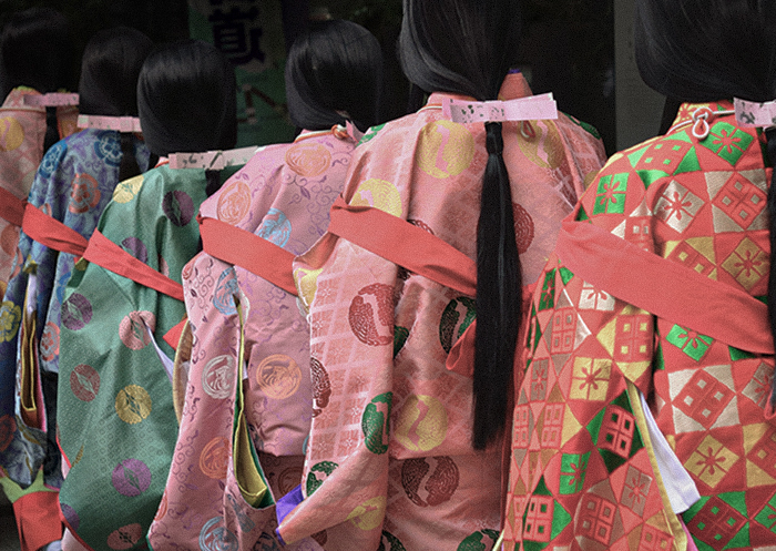
What follows is drawn from two Edo-period illustrated color manuals held in the National Diet Library Digital Collections: Usuyo Irome (『薄様色目』) by Nakamura Korenori, and Kasane Irome (『重色目』) by Ikai Masanori. A single combination name could refer to more than one pairing of colors depending on the source, and the seasons below follow the old lunar calendar, which ran one to two months behind the modern solar calendar — a kasane named for early spring, in other words, corresponds to what is still deep winter by today’s reckoning.
Spring
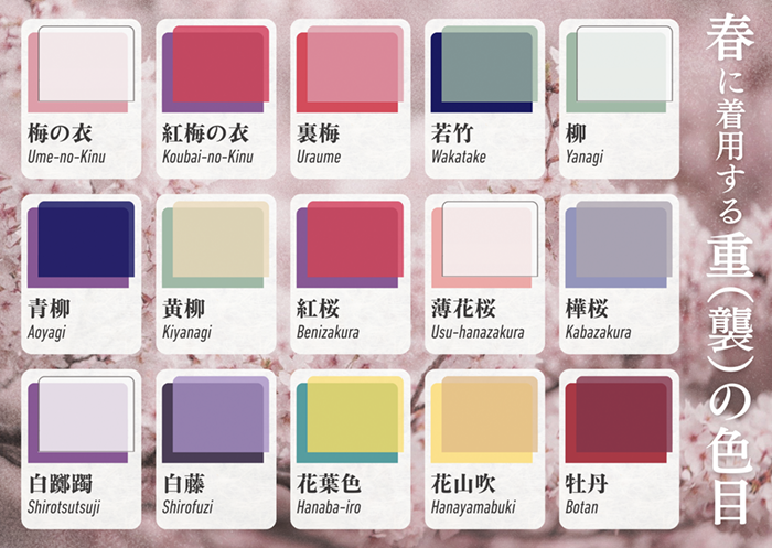
Plum, cherry blossom, and azalea dominate the names, and the palette leans toward the reds and pinks of the flowers themselves.
– 梅の衣 Ume-no-Kinu, “plum robe” — palest blush white over soft pink
– 紅梅の衣 Koubai-no-Kinu, “red plum robe” — violet-purple over rose pink
– 裏梅 Uraume, “plum, reversed” — rose pink over a deeper rose
– 若竹 Wakatake, young bamboo — sage green over deep navy
– 柳 Yanagi, willow — the palest green-white over soft green
– 青柳 Aoyagi, blue willow — deep indigo over muted purple
– 黄柳 Kiyanagi, yellow willow — pale celadon over soft yellow-green
– 紅桜 Benizakura, red cherry blossom — crimson red over purple
– 薄花桜 Usu-hanazakura, pale cherry blossom — the palest pink over salmon pink
– 樺桜 Kabazakura, birch cherry — pale lavender over blue-gray
– 白躑躅 Shirotsutsuji, white azalea — palest lilac-white over soft lavender
– 白藤 Shirofuji, white wisteria — pale lavender over deep violet
– 花葉色 Hanaba-iro, blossom-and-leaf color — teal over soft yellow
– 花山吹 Hanayamabuki, kerria in bloom — golden yellow over pale cream-yellow
– 牡丹 Botan, peony — deep wine red over a darker red
Two of these are worth pausing on: 紅梅の衣 and 紅桜 are recorded as the same pair of colors under two different names. Silk was precious enough that a single set of five layered robes represented real value, and giving the same combination a different name for a different season let a woman wear it again without appearing to repeat herself — a quietly practical kind of elegance.
Summer
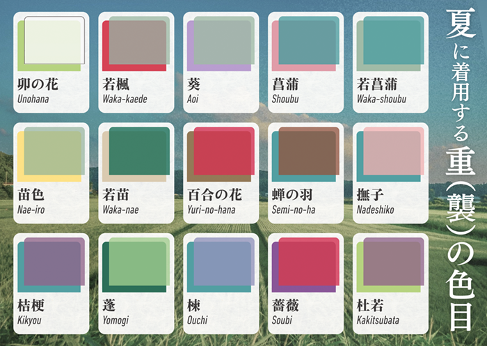
The summer names read as cool and fresh, and blue — or what the Heian court called blue — turns up constantly.
– 卯の花 Unohana, deutzia blossom — pale green-white over white
– 若楓 Waka-kaede, young maple — warm gray-taupe over crimson red
– 葵 Aoi, hollyhock — sage gray-green over lavender
– 菖蒲 Shoubu, iris — teal over rose pink
– 若菖蒲 Waka-shoubu, young iris — sage green over teal
– 苗色 Nae-iro, seedling color — yellow-green over golden yellow
– 若苗 Waka-nae, young seedling — deep green over pale sage
– 百合の花 Yuri-no-hana, lily blossom — crimson-rose over brown-mauve
– 蝉の羽 Semi-no-ha, cicada’s wing — warm brown-taupe over teal
– 撫子 Nadeshiko, fringed pink — rose pink over teal
– 桔梗 Kikyou, balloon flower — muted purple over teal-gray
– 蓬 Yomogi, mugwort — soft green over gray-green
– 楝 Ouchi, chinaberry — periwinkle blue over lavender
– 薔薇 Soubi, rose — crimson red over purple
– 杜若 Kakitsubata, rabbit-ear iris — mauve-purple over deep green
The recurring “blue” here needs a note. Heian-era word 青 ao spanned a much wider range than modern “blue” — from green through to gray. In 重の色目, colors recorded as ao read to the modern eye as very close to green, even though later documentation describes them in terms closer to today’s blue. We have rendered them here as blue-green throughout, in keeping with what the color combinations themselves show.
Autumn
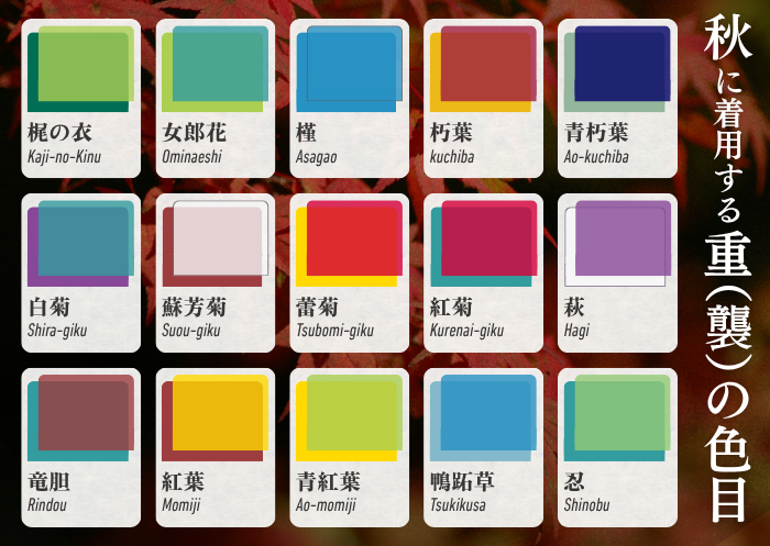
Chrysanthemum, bush clover, and turning maple leaves supply most of the names. Whereas spring and summer combinations nearly always pair two different colors, autumn includes at least one case of the same color worn twice, such as 槿 asagao.
– 梶の衣 Kaji-no-Kinu, paper mulberry robe — soft green over teal-gray
– 女郎花 Ominaeshi, golden lace — teal-green over yellow-green
– 槿 Asagao, morning glory — blue over pale blue
– 朽葉 Kuchiba, decaying leaf — brick red over golden yellow
– 青朽葉 Ao-kuchiba, blue decaying leaf — deep navy-indigo over sage green
– 白菊 Shira-giku, white chrysanthemum — teal-blue over purple
– 蘇芳菊 Suou-giku, sappanwood chrysanthemum — pale lilac-white over deep wine red
– 蕾菊 Tsubomi-giku, chrysanthemum bud — crimson red over pale yellow
– 紅菊 Kurenai-giku, crimson chrysanthemum — deep crimson over purple
– 萩 Hagi, bush clover — white over purple
– 竜胆 Rindou, gentian — deep wine-mauve over gray-blue
– 紅葉 Momiji, autumn leaves — golden yellow over brick red
– 青紅葉 Ao-momiji, green autumn leaves — yellow-green over teal
– 鴨跖草 Tsukikusa, dayflower (in its old, classical reading) — deep blue-purple over sage green
– 忍 Shinobu, hare’s-foot fern — sage green over deep green
Both 槿 and 鴨跖草 read, to a modern eye, as genuinely close to cyan. The blue involved is recorded elsewhere as 縹(花田)色 hanada-iro, the deep indigo-dyed blue we describe in our companion piece on Japan’s traditional colors — a rare case of a color name carrying cleanly across two very different articles.
Winter
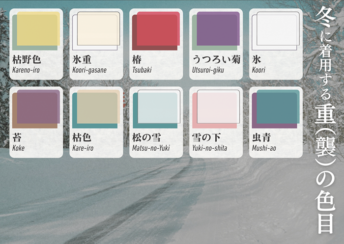
Winter has noticeably fewer named combinations than the other three seasons — a plain consequence of how little is actually in bloom. Where spring, summer, and autumn draw their names from flowers, winter turns instead to snow, ice, and the handful of plants that still show color in the cold.
– 枯野色 Kareno-iro, withered-field color — golden mustard over sage green
– 氷重 Koori-gasane, ice, layered — cream over white
– 椿 Tsubaki, camellia — crimson red over deep green
– うつろい菊 Utsuroi-giku, chrysanthemum in decline — purple over sage green
– 氷 Koori, ice — white over white
– 苔 Koke, moss — mauve-purple over olive
– 枯色 Kare-iro, withered color — sage-khaki over teal
– 松の雪 Matsu-no-Yuki, snow on the pine — pale ice blue over deep teal
– 雪の下 Yuki-no-shita, beneath the snow — pale pink over white
– 虫青 Mushi-ao, “wings of jewel beetle” — deep teal over purple
雪の下 is the one worth lingering on. The name and the colors together render a plum branch with snow settled over its blossoms — the combination doing, in color alone, what would otherwise take a sentence to describe.
Year-Round
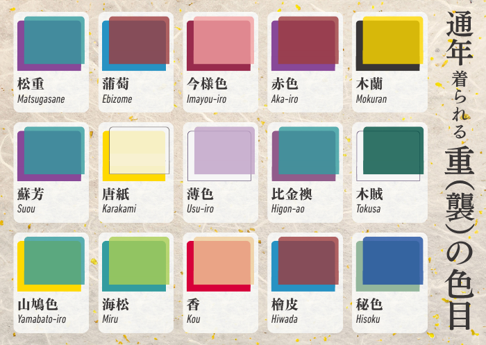
A smaller group of combinations were not tied to a single season at all. These draw on evergreen plants, on colors that were simply fashionable at the time, and on objects such as incense and decorative paper.
– 松重 Matsugasane, pine, layered — teal over purple
– 蒲萄 Ebizome, wild grape — wine-mauve over teal
– 今様色 Imayou-iro, “the color of now” — rose pink over a deeper pink
– 赤色 Aka-iro, red — deep wine red over purple
– 木蘭 Mokuran — golden yellow over black
– 蘇芳 Suou, sappanwood — teal over purple
– 唐紙 Karakami, decorative paper — pale cream-yellow over yellow
– 薄色 Usu-iro, pale color — pale lavender over white
– 比金襖 Higon-ao, “brocade weaving and blue” — purple over blue
– 木賊 Tokusa, horsetail — deep green over white
– 山鳩色 Yamabato-iro, wood pigeon color — teal over yellow-green
– 海松 Miru, seaweed — sage green over teal
– 香 Kou, incense — salmon over deep red
– 檜皮 Hiwada, cypress bark — deep wine red over teal
– 秘色 Hisoku, “secret color” — blue over teal
A few of these carried conditions beyond the season. 海松 was ordinarily worn as an outer 萌黄 moegi — bright yellow-green — over a 縹 hanada lining, but older wearers switched the lining to white. 松重 could only be worn from the age of fifteen until a woman was considered elderly — a color, in other words, assigned not just to a season but to a stage of life.
In Closing

襲の色目 is, in the end, one of the most direct expressions Japan ever produced of its relationship with the four seasons. Nearly every color named above belongs to the wider vocabulary of Japanese traditional colors we cover in our companion article — worth reading together with this one, since the two were always meant to be read that way.
KOTO is a journal of Japanese craftsmanship, culture, and the aesthetic sense behind them.
- SHARE
-


( daily-life )